When I was little, some of my friends went to a short session of camp every summer at Camp Henry in Newaygo, Michigan. When we were looking for a camp to host our wedding, this was one of the first places I contacted. It didn’t work out (because it’s a dry facility) and we ended-up at the incredible Camp Pendalouan.
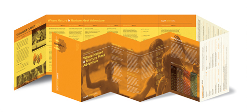
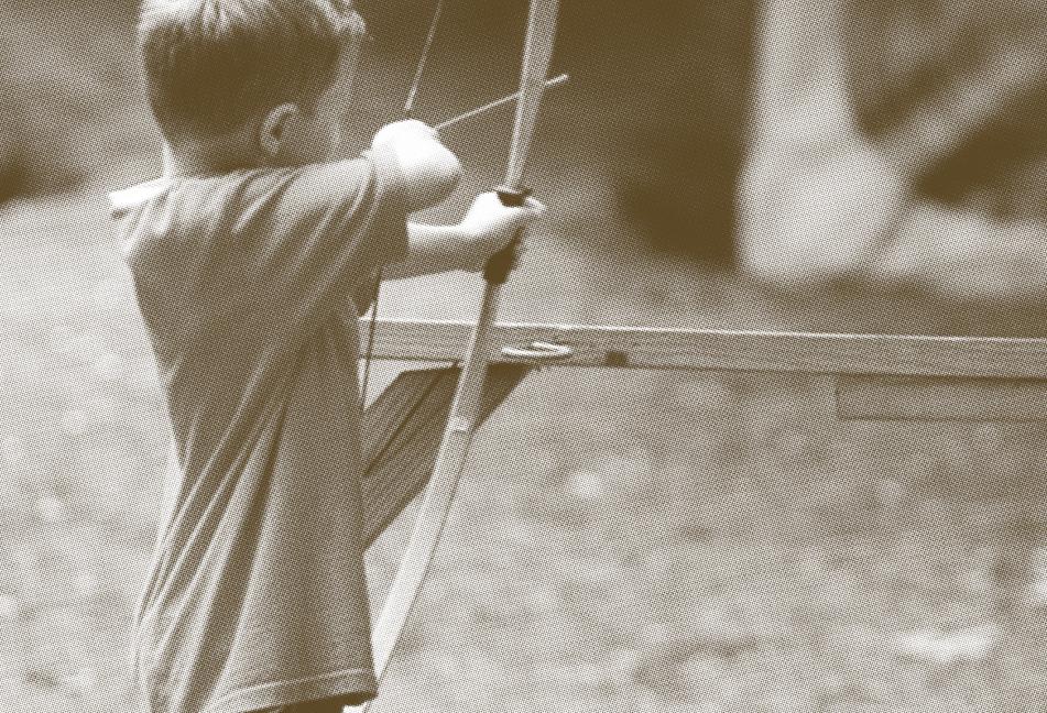
In April of this year, I came across a brochure for Camp Henry–so well-designed that I held onto it, despite having no need for the actual information contained inside. My favorite part is the large map but the whole thing is full of vivid colors, distinctive type, playful graphics and half tone photos of kids at camp. The design feels somehow both modern and retro – combining the right elements to elicit everything you’d expect from a contemporary summer camp (nostalgic, playful, military-like…).
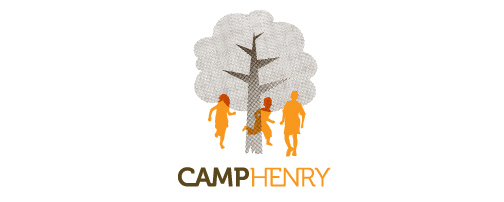
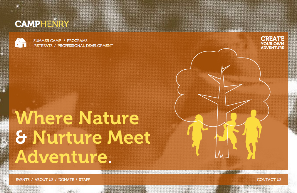
This redesign happened last year, sometime after I looked into Camp Henry as a possible venue. The design work was done by a team at Deksia, a design firm in Grand Rapids, Michigan. I think it screams of fun and campfires, of old meets new. I love the Create Your Own Adventure tagline and website function (where you can add activities to a schedule and email it to yourself). But, again, the map is my favorite part–I just love camp maps.


[image credits: CampHenry.org and Deksia.com]